The perfect typeface
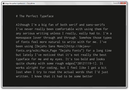
Although I’m a big fan of both serif and sans-serifs I’ve never really been comfortable with using them for any serious writing unless I really, eally had to. I’m a monospace lover through and through. Somehow those types of fonts feel more natural to write with for me. I’ve been using DejaVu Sans Mono for a long time but lately I’ve noticed that it’s not really the best typeface for me and my eyes. It’s too bold and looks quite chunky with some rough edges1. It works alright for coding, but I feel like I get a bit lost when I try to read the actual words that I’d just written. I knew that it had to be some better alternatives out there.
Inconsolata is an excellent typeface. It doesn’t look too good when you’re using it in smaller sizes2 but I find it absolutely delightful to use with the size set at about 21px and line-height at 125% when I’m typing away in FocusWriter. It may look a bit too thin for some, but for it’s just what I need. I usually try sit at a comfortable distance from my screen so the thinness is not really that bad at all. I also tend to use pretty neutral colors in the grayscale range which typically works good with any kind of typeface.

My hunt for something better is finally over and hopefully it’ll make me be more productive when it comes to writing. I’d like that.